New Year – New Room! Why not.
No one can deny that colours are emotive, so what better way to make your room look and feel better than with a splash of colour?
Here at The Parlour we exclusively use Annie Sloan Chalk Paint. Her palette of colours is very broad and with a little dexterity you can literally create any shade you desire by mixing them together. The only limit is your imagination!

Most of us are a little bit apprehensive when experimenting with bold colours in our home, so we tend to stay in the safe zone with simple neutrals (nothing wrong with neutrals by the way - I write this from my grey, cream and duck egg blue dining area!) However - do not be afraid of the colour-wheel, fellow home-makers! Let the Parlour Maids guide you…...through the wonderful wheel of colour!!
The colour wheel may appear a tad mystifying at first glance, but essentially the basic rules of colour matching are really very simple.
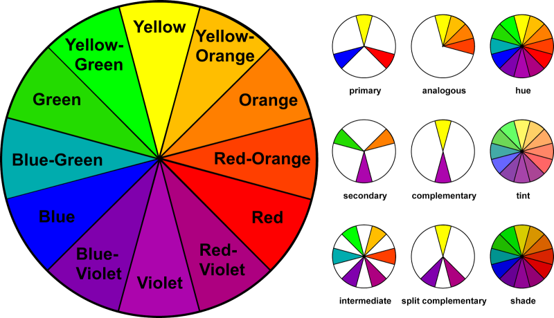
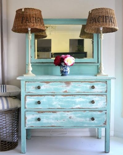
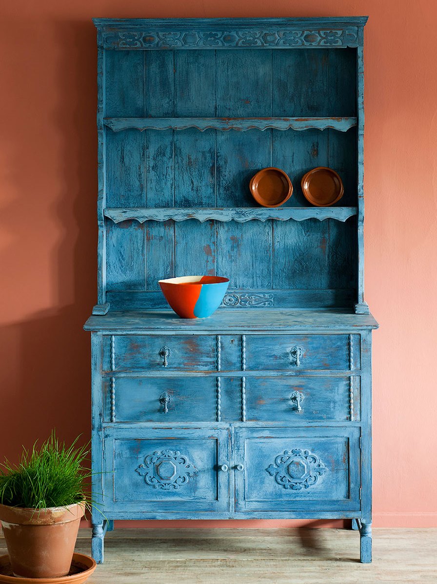
Choosing a bold colour for your room can be fun and refreshing, and can bring the whole room together. According to colour theory, complementary colours are any two colours opposite each other on the wheel. This creates a stunning dramatic look and is great for when you want a piece of furniture to stand out for maximum drama! Ideally, you can use one colour as background and the other as accents.
For example, a blue dresser against an orange wall!

Tah Dah!
See how fabulous this looks!? Not scary at all.
Of course, if we prefer, we can use tints and shades of the wheel such as a lighter tint of blue against a darker orange.
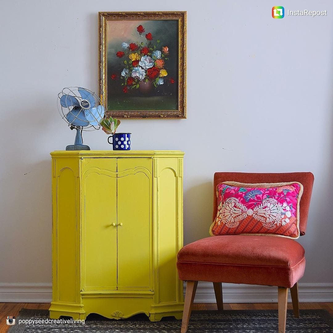
Why stop there? You can also use any three colours equally spaced around the colour wheel forming a triangle. As if by magic – these colour schemes remain harmonious regardless of the rotation angle around the wheel! See!??? How did we ever decorate a room without the colour wheel!?

this
image proves that some colours you think would never work together - actually do! We LOVE the mustard yellow against the dark blue wall! (3 down 3 across)
Feeling braver yet?
Here’s a good cheat; Take one colour and match it with the two colours adjacent to its complementary colour. For example, blue, yellow-orange and red-orange.
This scheme is ideal for beginners because it is difficult to mess up. That's because you get contrasting colours - but they aren't as diametrically opposite as complementary colours.
Easy, huh?
And here’s another thing you already knew; Warm colours convey energy and joy, while cool colours bring calmness and harmony to a room. The wheel itself can be divided easily to get an idea of which colours are warm and which ones cool, shown below;

And finally, 3 more cheats;
1. More than one colour in a room looks great, but don’t go mad – keep it to 3 colours max. If you’ve chosen two bold colours, be sure to choose a softer natural colour for the third to give your eyes a break.
2. Start by selecting your boldest colour and then choose the others with the first colour in mind.
3. Don’t be afraid! Paint is not permanent! You can always change it again next season!
There's an app for everything; SwatchMatic for Android identifies any colour you point your camera to and suggests which colour to match it with using the basics of the colour wheel! For iPhone, ColorSnap is good.
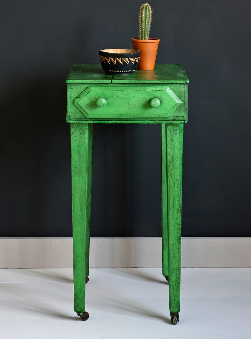
Right then, off you go to Ace for that magnificent navy-blue paint for the hall, and don't forget the Parlour Maids are here to assist you with that hall table to be painted in that beautiful vibrant green that really makes you smile!
Go play with COLOUR!
END